William Shakespeare
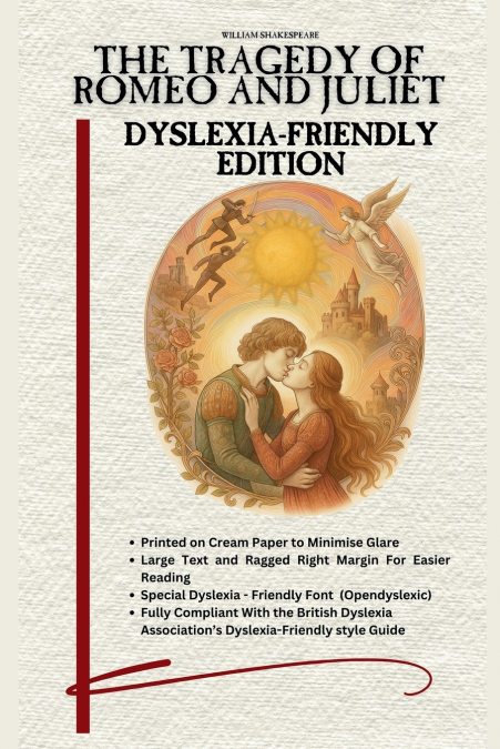
This Dyslexia friendly edition has been specially adapted for easy reading.This version now has improved ease of reading, maximising the line spacing even more. We have also added line numbers to enable quick finding of set extracts. The pages are printed on cream paper (to cut glare), have wider margins and line spacing, and use a dyslexia-friendly font (Opendyslexic) to make the text clearer. Both bold and italic text have been minimised throughout. The text also has a ragged right edge (rather than justified) to make the text easier to follow, with extra spacing between each paragraph. These amendments make the text fully compliant with the British Dyslexia Association’s Dyslexia friendly style guide.